
Fluid Art Color Combinations: A Beginner-Friendly Guide to Harmonious Pours
More colors don’t always make a pour more expressive. A thoughtful selection gives each shade room to move, while an overcrowded palette can blur into a muddy mix. If you’re unsure how many colors to combine or which ones will work together, start by thinking about the effect you want. Exploring fluid art color combinations is less about finding one perfect formula and more about balancing harmony, contrast, and movement.
This guide shows you how to choose a palette for a particular mood or effect, even if you’re just beginning. You’ll learn how analogous, complementary, and split-complementary colors can shape a pour, and how differences in lightness and intensity can help shades stay distinct. We’ll also look at why pigments can interact in unexpected ways and how to test a palette before committing to a canvas. With a few practical steps, choosing colors can feel less like guesswork and more like part of the creative process.
Table of Contents
Fluid Art Color Combinations: Start with Harmony, Contrast, and Mood
A palette is a planned group of colors chosen to create a visual effect. In fluid art, harmony helps the colors feel connected, while contrast makes individual areas easier to notice. Depending on the hues you choose and how they move across the canvas, a pour can feel calm and spacious, warm and glowing, lively and energetic, or rich and dramatic.
Color harmony in fluid art is the way chosen hues work together to create a sense of visual connection. Harmony doesn’t mean every color has to look similar. A thoughtful contrast can add a focal point and give the eye somewhere to rest as the paint flows. The fundamentals of color theory offer a useful starting point for understanding how colors relate, but your response to a palette matters too.
How color relationships create a cohesive palette
Think of the color wheel as a simple map. Hues that sit close together, such as blue, blue-green, and green, often feel related and create a gentle transition. Colors across the wheel, such as blue and orange, tend to create stronger contrast. Neither relationship is automatically better. Each gives a pour a different kind of movement and presence.
For example, use teal as your dominant color, blue-green as a supporting hue, and a small touch of warm ochre for contrast. Teal anchors the palette, the neighboring hue keeps it connected, and ochre draws attention without taking over. Give each color a role instead of asking every shade to compete equally. That’s a practical starting point for fluid art color combinations.
Choose a mood before choosing your paint colors
Before selecting paint, describe the feeling you’d like the finished piece to evoke. Words such as “sunlit,” “playful,” “quiet,” or “dramatic” can help narrow your choices. Warm hues such as red, orange, and yellow may suggest a lively or glowing impression, though these associations aren’t fixed rules. A muted orange can feel earthy, while a bright yellow may bring more energy.
For a quieter palette, begin with cool blues or greens, then soften their presence with a neutral such as white, grey, or beige. One contrasting accent can add a spark without changing the overall mood. Try a soft blue-and-grey pairing with a small warm accent, or leave the accent out and compare the effect. Let curiosity guide your choice. Your first plan is a starting point, not a rule.
5 Fluid Art Palette Families: Analogous to Complementary
Palette families give you a structure for choosing colors without locking you into a fixed recipe. Each creates a different visual character, and the examples below are starting points to adapt to your taste. For a helpful overview of how hues relate on the color wheel, explore this guide to color theory.
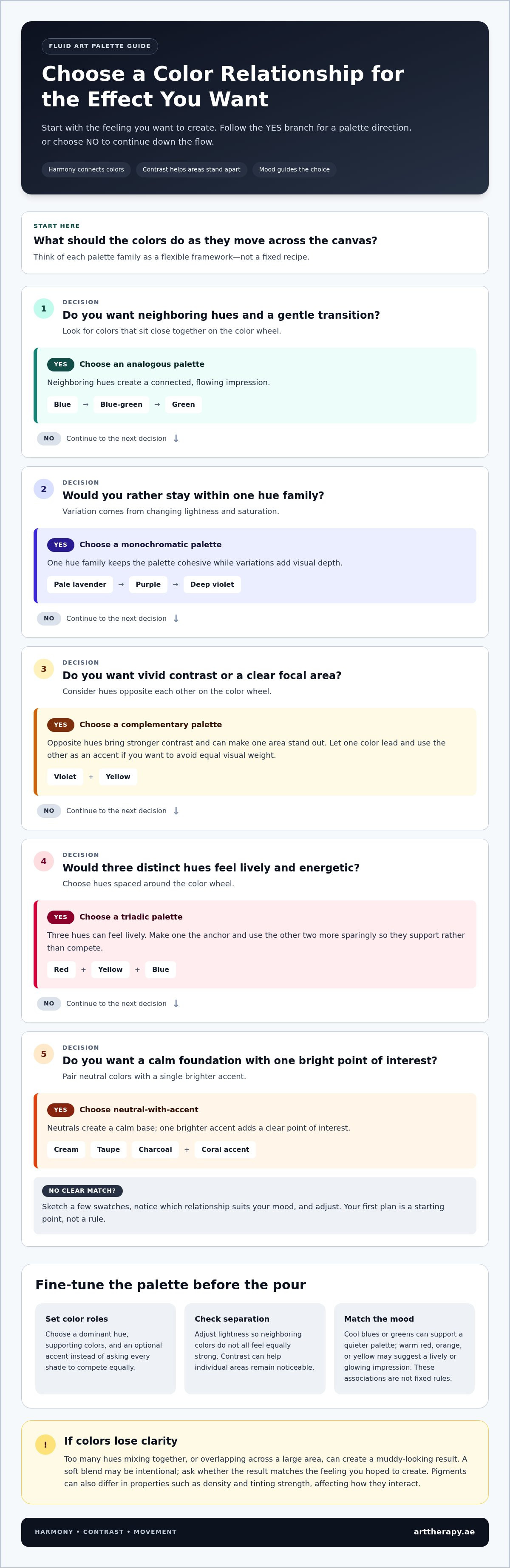
Analogous: Choose neighboring hues, such as blue, blue-green, and green, for a connected, flowing impression. Try this family when you want a gentle transition across the canvas.
Complementary: Pair hues opposite each other on the color wheel, such as violet and yellow, for vivid contrast that can bring energy and focus. Use this relationship when you want one area to stand out.
Monochromatic: Build around one hue, using variations in lightness and saturation. Several versions of purple, from pale lavender to deep violet, can feel cohesive while still offering visual depth. This is a good option for a unified palette with subtle variation.
Triadic: Select three hues spaced around the color wheel, such as red, yellow, and blue. The combination can feel lively, so make one hue the anchor and use the other two more sparingly.
Neutral-with-accent: Combine neutrals such as cream, taupe, or charcoal with one brighter accent, such as coral. This creates a calm foundation with a clear point of interest, useful if you’re easing into bolder color.
Analogous and monochromatic palettes for gentle transitions
Neighboring hues often feel naturally related, making analogous palettes a comfortable place to begin. Pair blue with blue-green and green, adjusting their lightness so the colors don’t all feel equally strong. A monochromatic palette stays within one hue family. Shifting from pale lavender to deep violet adds variation while keeping the overall impression connected.
Complementary and triadic palettes for stronger contrast
Analogous combinations use nearby hues for a connected feel; complementary combinations pair opposite hues for stronger contrast. With complementary colors, let one lead and treat the other as an accent if you want contrast without equal visual weight. Triadic palettes bring three distinct hues into the mix, so choosing a dominant color helps the other shades support rather than compete with it.
There’s no need to decide by theory alone. Use these fluid art color combinations as flexible frameworks: sketch a few swatches, notice which relationship suits your mood, and adjust from there. To explore the choices hands-on, join the Fluid Art Workshop in Dubai at Art Therapy.
Why Fluid Art Colors Turn Muddy, and How to Preserve Their Clarity
Colors can lose definition when too many hues mix together or overlap across a large area. That can create a muddy-looking result, but it isn’t the same as a soft blend. A gentle transition may be exactly the effect you want, while a muddy appearance may feel less clear or vibrant than intended. Neither outcome is automatically a mistake. The useful question is whether the result matches the feeling you hoped to create.
Paint behavior depends on the materials and the way you pour. Pigments can differ in properties such as density and tinting strength, which can affect how they interact and move. GOLDEN Artist Colors’ practical color mixing guide offers background on acrylic paint and pigment behavior. Treat a palette as a starting plan, not a guarantee. The same fluid art color combinations may behave differently with different paints or techniques.
How contrast, value, and saturation affect color separation
Value means how light or dark a color appears; saturation describes its intensity. When two colors have similar values, their boundaries may be harder to see where they meet, even if their hues differ. For example, two deep, saturated colors can merge into a less distinct area. Adding a lighter or darker shade, or a less saturated neutral, can give the eye a visual pause and help nearby colors remain distinct.
Look at your chosen colors side by side before pouring. Ask whether each has a clear role and whether neighboring shades need more difference in lightness or intensity. You don’t need strong contrast everywhere. A single lighter channel or muted section can create breathing room while preserving a blended, fluid feel.
Simple ways to reduce unwanted color mixing
Start with a manageable palette while you’re learning how your paints interact. Fewer hues make it easier to notice which combinations hold their separation and which soften as they meet. Pour order and placement matter too. Placing contrasting colors beside each other may make their meeting point more noticeable, while layering or positioning colors so they overlap more extensively can encourage a broader blend. The result still depends on the paint and your technique, so test your choices.
Make a small test swatch using the paints and pouring approach you plan to use.
Let the colors meet as they might in your pour, then check whether you like the transition.
Photograph the test in natural light. If colors look too similar, adjust their lightness, saturation, or palette before moving to the canvas.
A test isn’t a pass-or-fail verdict. It’s a simple way to learn how your colors respond, so you can make the next choice with more confidence.
How to Build and Test a Fluid Art Color Palette Step by Step
A little planning can make choosing colors feel more open, not less creative. Rather than picking paints at random, give each shade a role and let a small test guide your next decision. Choose a mood, select a palette family, anchor it with one dominant hue, then test and refine the supporting colors.
A beginner-friendly sequence for choosing colors
Begin with a mood word or a visual reference. “Quiet,” “sunlit,” or “bold” gives you a simple direction before you reach for paint. You might also think of a place, a season, or a feeling you want the artwork to hold. One word is enough to start.
Choose a palette family. Decide whether you’re drawn to neighboring hues, a one-hue palette, stronger opposites, or another relationship that suits your idea.
Select a dominant hue. Let one color lead the composition. For a calm, cool impression, for example, choose blue as your anchor.
Add supporting colors. Choose a small number of shades that connect with or gently contrast against the dominant hue. A blue-green support and a lighter, less saturated blue could add variation without crowding the palette.
Consider one optional accent. A touch of a contrasting color can draw the eye, but leave it out if the palette already feels complete.
Keeping the selection manageable makes it easier to notice how each color behaves. It also gives the dominant hue space to guide the overall feeling, rather than asking every shade to lead.
Refine your palette after a small test pour
Before using your palette on a larger canvas, make a small test with the same paints and a similar pouring approach. Notice which colors stay distinct, where they meet, and whether any blend more than you intended. You’re gathering information, not judging your ability.
If something feels off, change one element at a time. You might swap a supporting hue, lighten or deepen one color, or remove the accent. Keeping the other choices steady makes it easier to see what the adjustment changes. If you alter several colors at once, it can be harder to tell which shift helped.
Pause to reflect on the test: does it carry the mood you chose, and is there enough difference between the areas you want to notice? Your first attempt doesn’t have to be the final palette. Each test can teach you how your paints move together, making fluid art color combinations easier to approach with curiosity and less guesswork.
To explore color choices through hands-on pouring, join a Fluid Art Workshop in Dubai at Art Therapy.
Bring Your Fluid Art Color Ideas to Life in a Dubai Workshop
Planning a palette on paper is a helpful start, but seeing paint move in person can reveal things a color chart can’t. As the pour develops, notice how placement changes the direction of the flow, where colors gather, and whether the composition feels balanced. It’s a chance to experience your fluid art color combinations as they unfold instead of guessing how every shade will interact.
What to notice while experimenting with a palette
Give yourself room to observe before deciding whether a pour has gone “right.” Notice how a color placed near the edge differs from one at the center, or how a small accent shifts the balance of the whole composition. Pay attention to the combinations that feel expressive or comfortable to you. Your response is useful information, even if it differs from the effect you first imagined.
Unexpected results can become discoveries. A color that spreads more than expected might inspire a gentler palette next time, while an unplanned blend could suggest a new combination to test. Each choice helps you understand your preferences. The aim isn’t to control every movement, but to stay curious as the artwork takes shape.
Continue exploring fluid art and creative practice
Art Therapy’s Fluid Art Workshop in Dubai welcomes beginners and experienced artists to a supportive studio environment on Sheikh Zayed Road. Hands-on practice gives you space to experiment with color, observe how the artwork develops, and learn through the process without pressure to produce a perfect result. To explore more of the studio’s creative offerings, visit art workshops in Dubai.
Let your next palette begin with curiosity, not a demand for certainty. Bring a color idea, follow an unexpected turn, or simply enjoy watching the paint move. Explore the Fluid Art Workshop.
Let Your Next Pour Begin with Curiosity
Balanced fluid art color combinations come from more than choosing attractive shades. Start with a mood, use a palette family to guide your choices, and let contrast help colors hold their place. A small test can show how your paints meet and move before you commit to a larger pour.
Most of all, leave space for discovery. A blend you didn’t expect may point toward a new idea, and each experiment can help you understand what feels expressive to you. The process doesn’t need to be perfect to be meaningful.
Explore color through hands-on practice at Art Therapy’s Fluid Art Workshop in Dubai, a welcoming studio for beginners and experienced artists. Book a Fluid Art Workshop and give yourself room to experiment, learn, and enjoy the pour.
Frequently Asked Questions
What are the best color combinations for fluid art?
The best fluid art color combinations are the ones that support the mood you want and give colors room to stand apart. For a gentle, connected look, try neighboring hues such as blue, blue-green, and green. For more contrast, pair opposites such as blue and orange. You can also work with one hue in different shades or use neutrals with a single bright accent. Test your choices to see how they move together.
How many colors should I use in a fluid art painting?
Start with three colors, then add one optional accent if the palette needs more contrast. For example, choose a dominant blue, a lighter blue-green to support it, and a neutral to create breathing room. A smaller palette makes it easier to notice how each paint behaves and whether the colors remain distinct. There’s no fixed rule, so treat this as a manageable starting point and adjust as you gain experience.
Why do my fluid art colors turn muddy?
Colors can look muddy when many hues mix together or overlap extensively, making their boundaries less clear. Shades with similar lightness and intensity may also be harder to distinguish when they meet. Paint properties and pouring technique affect how colors interact, so the same combination won’t always behave identically. Try reducing the number of colors, creating more contrast between neighboring shades, and testing a small sample before using the palette on a larger canvas.
Can I use complementary colors in acrylic pouring?
Yes, complementary colors can create lively contrast in acrylic pouring. They sit opposite each other on the color wheel, such as blue and orange or violet and yellow. To keep the composition balanced, choose one as the dominant hue and use the other more selectively. If the two colors blend extensively, their separation may become less noticeable, so test how they meet with your paint and pouring approach before committing to a larger pour.
What colors create contrast in fluid art?
Opposite hues, such as blue and orange, can create strong color contrast. You can also build contrast with value, which is how light or dark a color appears. A pale blue beside a deep navy may be easier to distinguish than two similar mid-tone blues. Saturation matters too: placing a vivid hue beside a softer, muted color can make the brighter shade stand out without adding another highly intense color.
How do I test a fluid art color palette before pouring?
Make a small test using the same paints and a similar pouring approach you plan to use on your canvas. Observe where the colors meet, which remain distinct, and which blend more than you intended. Photograph the test in natural light to review the colors clearly. If you want to refine the palette, change one element at a time, such as lightening a shade or removing an accent, so you can notice what the adjustment does.
Are warm or cool colors better for fluid art?
Neither warm nor cool colors are inherently better; choose according to the feeling you want to explore. Warm hues such as red, orange, and yellow may suggest energy or glow, while cool blues and greens can create a quieter impression. These associations are personal, not fixed rules. You can also combine temperatures, perhaps using a cool palette with one warm accent, then test whether that contrast feels balanced to you.


Comments